

This guest post comes from Ffion Evans. Ffion is a freelance designer and founder of Kaleidoskop. She helps freedom-seeking, rule-breaking entrepreneurs stand out and monetize their unique brand of creativity by building a powerfully personal and functional online presence.
I hate to say this as a designer, but sadly, online success is about more than gorgeous visuals. You can have the most beautiful website filled with outstanding copy, but if your website visitors can’t find what they’re looking for quickly, your design has failed its purpose.
Here are common mistakes + how to fix them!
THE PROBLEM: Readers can’t tell what’s important or what they should do next
Did you think about your headers tags? Or how you segment your posts? Do you have multiple navigation menus? Is some of your best stuff hiding in a drop down menu?
THE SOLUTION: Try looking at your pages as though you’re seeing them for the first time
Does the design help people find what they’re looking for? Is your message clear? Is the navigation obvious? Don’t make your visitor think too hard. If your site content is not structured well, the reader will wander aimlessly for a few moments, get confused and irritated and leave without a second thought.
Use headings, subheadings, lists to segment your site and make it easy for visitors to scan your page content and understand your copy. Make sure your site is clearly structured and devoid of clutter.

THE PROBLEM: Messy menus irritate + confuse your readers
Are your navigation items recognizable as navigation items? Or are they hidden behind obscure references? Are they structured in a way that makes it easy to navigate the site? If the navigation is poorly structured it’ll be impossible for your users to find what they’re looking for.

THE SOLUTIONS: Keep your navigation structure as simple as possible
Not every page of your site needs to be part of the main navigation. Your main navigation should be clearly labeled and intuitively structured primary pages. Multiple-level drop-down menus with hundreds of links are just overwhelming. If your site has tons of content, consider a second level of navigation for each subcategory or add links and related pages to the sidebar or footer.
Be concise with navigation text
Use commonly understood labels such as Home, About, Services and Contact. I know it’s tempting to label a tab something clever like “Let’s jam!” or “Stuff you should know” but people are busy and easily confused. There is a good reason those tab names are used a lot!
Users need to be able to find their way around your site easily and intuitively; the navigation should be consistent throughout your site. If users can’t find what they want in less than three clicks, they’ll leave.
Want to see where people click? CrazyEgg shows you ‘heat maps’ will help you find out which areas are poorly labelled or redundant.
THE PROBLEM: Broken links
Broken links, things that look like links but aren’t, links that don’t stand out are a huge pain in the butt for your user. They also make you look unprofessional and a little untrustworthy!
THE SOLUTIONS: Test all links on your site
When you’re linking to other sites, you can’t really control what happens after you link out. Maybe the site you linked to will go down or will be bought by a new company. Those links are outside of your control, so test them on a regular basis.
This free tool will scroll your entire website looking for broken links. It’s incredibly gratifying/embarrassing.
Make sure links stand out clearly from the body of the text
Use textual descriptions for links. Rather than writing “click here,” write “I loved this post about how to DIY your own writing retreat.” You should also provide alt text for linked images. Alt text stands for “alternate text” and is a certain description, known as an attribute, added to an image tag in HTML.
I know that sounds super confusing, but what it really means is that when an image can’t be displayed for some reason, this is the text that appears inside the image container as an alternative. Because search engines can’t see what’s on an image, alt text also helps search engines understand what the image depicts, allowing them to discover your images and add them to their image search results.
Alt text is also read out by screen readers and helps improves the accessibility of your site and explain image content to people with special needs. Try not to add too many keywords into your alt tags as this may be interpreted as spammy. Aim to write descriptive and helpful texts that actually describe what the viewer would see in the image.
WordPress lets you add alt text to your images when you upload them via the media uploader:

To add or change the alt text of an existing image, you can do this by visiting Media » Library and clicking on the image you’d like to edit the alt text of:

To avoid confusion, don’t violate common expectations for how links work.
Make super obvious to the user what’s clickable and what’s not:
- For text links within your copy, use coloured and preferably underlined text.
- Don’t underline non-link text on the web, it suggests a link where there isn’t one. For the same reason, don’t show text in your chosen link colors unless it actually is a link.
- Differentiate visited and unvisited links so people can tell where they’ve been. Unvisited links should be brighter and more saturated than the color for visited links. For the links that have already been clicked on, use a lighter or duller shade of the main link colour, so it looks a little more washed out and “used”. Use variants of the same color if possible, so visitors can tell they’re related.
Really, good site navigation comes down to two things: keep it simple + keep it consistent.
Have fun cleaning up your navigation! Your visitors will appreciate it, have a more enjoyable time browsing your site and services and be more likely to take the actions you intended.
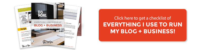
Need more? Download a free guidebook covering 17 common website design mistakes and how to fix them.


This is so useful, thank you!
There’s a product out there called UserTesting in which companies pay people on the Internet to try to use their websites while talking out loud. (I actually am a “tester” for UserTesting, which is a fun side income stream.) If paying someone to test your site isn’t an option, and I understand that it’s probably not for most of us, you can still ask a friend to do it while you watch over their shoulder. Have them load your site and then ask them things like: What do you think this site is for, based on this page? What can you do here? Can you try to do X (where X is “hire me for a project” or “look at my portfolio” or “try to buy the terrarium on the front page”) and talk about it as you do? What would you expect to see if you click on this link?
I think this sort of feedback would be super helpful, and it’s easier than self-assessing IMO. 🙂
Ha! Did you see that J. Crew redid their nav super-shortly after this post went up? Hilarious. Also: such a useful post.
Ha! No. So funny!