
I wish I could start this post by telling you that appearances don’t matter. I want very much to say your work will be judged by the results you get for your clients. It’d be great if we could nestle carefully chosen words in a terribly designed blog.
Buuuut that’s not how the internet works.
The reality is: the images we choose to accompany our blog posts matter almost as much as the words in the blog posts. And when we make better blog post images, more people read our stuff.
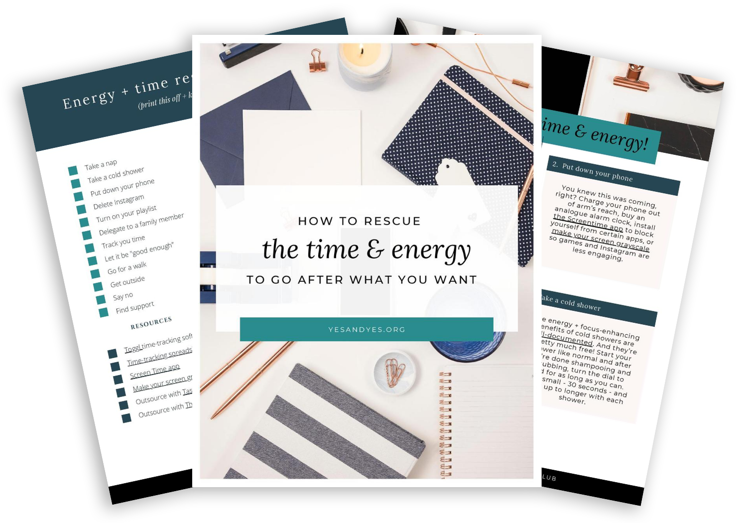
Today, graphic designer Elise Epp is sharing how non-designers like us can make our blog images better. Elise’s made-to-measure visual branding and websites capture the heart of her clients’ businesses and give them room to grow. She designed most of the ebooks in my secret library!

11 ways to make better blog images
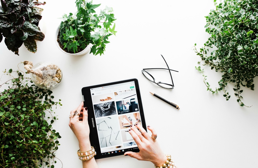
Adding images to your blog posts is a simple way to make your posts more readable and more shareable. They break up large chunks of text, making it easier on your readers (and skimmers). They also provide a way to share your post on Pinterest and lead to higher click rates on other social media.
Making your blog images look real good is only slightly harder. Like wearing dress pants instead of regular pants. And your blog will look so much better!
Picking Photos
Don’t use crappy photos.
Not comfortable behind a camera? Use stock photos or hire a photographer. (Some photogs will do a custom social media pack for you using your products or branding.)
Beware copyright laws!
Be very, VERY careful when using photos that you didn’t take yourself or purchase from a legitimate source. I can speak from personal experience (eek!). Letters asking for payment – or they’ll sue! – is an actual thing that can happen, even if your blog seems tiny.
Don’t use Google or Pinterest to find photos. << Write that in giant letters above your desk. Imagine getting a letter demanding $2,000 for using an image you shouldn’t have. (Yup, this includes images in collages or moodboards.)
Sufficiently scared? Good. Here are some sites that offer free, high quality stock photos:
- Pexels
- Death to Stock Photo
- Kaboompics
- Unsplash
- Splitshire
- Pickle Jar
- Flickr Creative Commons (double check the photo’s attribution license)
- Gratisography
Stocksy and Creative Market have really good options for creative bloggers and businesses at an affordable price. Using a paid service like these gives you a greater chance you won’t run into the same photos on all your friends’ blogs too.
Sizing
Don’t use photos that are too small.
If you have to squint to see the photo, it’s definitely too small. But don’t enlarge the small photo! It will just appear blurry. What to do???? Check to see if there is a higher resolution file of the photo. Otherwise I’m sorry honey, but you shouldn’t use this photo on your website.
Don’t use photos that are too big.
Is your photo fresh off your camera? It’s probably too big for your website! Large photos will slow down your site, so don’t upload it to your website until you’ve resized it.
“But my website automatically resizes it!” Nope, the picture is showing up smaller, but the file is still just as big. Instead, resize your images before you upload them to your website. If you don’t have Photoshop or Lightroom, you can use free apps like Canva, Picmonkey, Gimp, or loads of others.
Make your photos the full width of your blog.
A pet peeve of mine is when otherwise gorgeous blogs are mired with a hodge podge of image sizes. Take advantage of all the space you have – and be consistent about it!
Personalizing Images
Add overlays.
Adding an overlay to a stock photo will make it more identifiably yours – you know, in case everyone else is using that same free stock photo on their blogs. And when people share it on Pinterest, they’ll know what to expect when they follow the link back to your site!
Check out the Yes and Yes image overlays:
- White box with black text
- Same font every time
- Italicize a few important words
Here are a few decisions to make:
- What font(s) will you use? You can use up to two fonts in your overlays – but use those same one or two fonts every time.
- Will you have a background to make the text more visible?
- If not, choose images that don’t have a lot going on – at least a large enough section to put your text.
- If so, what color will it be? Will it be one rectangle behind the whole block of text like on Yes and Yes or will you have a separate rectangle around each line of text? Will it be opaque or transparent? What colour will it be?
- It’s also a good idea to include your logo or website so that people can easily find you and your blog post if your image gets shared.
Using stock photos? Crop ‘em!
If you’re using photos from the same pool as everyone else (i.e. the free stock photo pool) make your images less recognizable by cropping them. And don’t just crop them down to the size you need. Zoom in (but not so much that the image becomes blurry) to a part of the picture that isn’t the focus.
Stick with a color palette or aesthetic.
Does your website use bright whites and neutrals? Muted greys and browns? Bright colours? Consider how the color palette and mood of the photo will fit with your blog’s aesthetic.
Optimizing for Social Media
Use alt-text attribute.
Not only does Pinterest pull this information for the default description, but it makes your website more accessible for people who use screen readers. Win-win!
Use a featured image.
Social media sites like Facebook and Twitter (if you’ve set up Twitter cards) will pull the featured image to preview your link. Stats repeatedly show that people are more likely to click on a post with a photo. Need I say more?
Consider orientation.
Portrait orientation (taller than it is wide) is better for Pinterest, but landscape (wider than it is tall) is better for pretty much everything else. On my own blog I work around this by setting a landscape feature image and including a portrait orientation in the body of the post.
Now go forth and write your blog posts and fill them with darn good images!
P.S. Everything I use + recommend to run my business
Loved the tips, I’m always looking for ways to improve my blog and photos!
Charmaine Ng | Architecture & Lifestyle Blog
http://charmainenyw.com
This was so helpful! I didn’t know there were sources for free stock images. Sometimes I feel like I have to wait on a post because I don’t have the photos to go with it, so this is going to really come in handy. Thanks so much! 🙂
http://www.wonderlandsam.com
First I want to apologize if I am posting this twice, but I’m not sure if my comment went through when I tried the first time.
I want to start by thanking you for mentioning people using screen readers and to add the ALT text. I am legally blind and use a screen reader and it is always a nice surprise when I get a photo described.
I also have a question since we are talking about pictures. Since I am legally blind, I tend to use graphics more than actual photos because I can see them. I would like to know your opinion if this is okay or not. I like to be fun since the subject of disability is not generally all that fun. Would it be better if I used actual photos that I am not really sure what they look like? I do generally get all my graphics and photos from Pixabay and they do a pretty good job of describing what the photo looks like, but many times they look dark to me so I really have no clue what they look like. I just want my blog to look nice and inviting. Thanks so much for your input.
Hi Yvonne! Web accessibility is such a big area that I/the majority of internet users don’t know nearly enough about – but adding alt tags is such an easy thing to do!
I just took a quick look at your site and I think it’s totally okay to use graphics – especially if you can see them better. What I would try to do, though, is make sure your blog images aren’t pixelated (blurry).
For example, in your post from March 1 (Keep Trying) the image that you’re using of a country road is only 316 pixels by 180 pixels. In the blog post, it’s being stretched to 474 pixels wide, so the photo appears blurry.
It looks like your blog automatically resizes featured photos to a 474 pixel square? So make sure that any images you use are AT LEAST 474 pixels wide and tall. And because your images are automatically cropped, graphics with words are being cut off, so I’d aim for graphics that are already squares.
Thanks, but how do I know what the pixels are so I can try to make sure my pictures are not blurry? Everything looks blurry to me. It’s nice to know that my blog automaticly sizes my pictures so I don’t have to worry about sizing them like the post suggested.
Really great article. Thanks for taking the time to explain things in such great detail in a way that is easy to understand.